REDESIGNING THE PAYMENT FLOW OF A GAS STATION APP
What
The challenge was to improve the payments flow which allows users to pay at the pump with the app. To tackle this, I set up a discovery and a design sprint and worked on the designs individually.
Responsibility
I was the service and UX designer and responsible for running the project with a team of 3 people. I involved part of the scrum team and fellow designers during the process to get inspiration and feedback.
Result
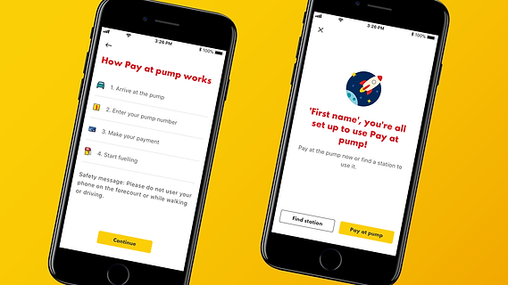
Redesign of the whole payments experience, from the first time usage to a regular payment. Which resulted in an uplift of about 5% of first time users making an actual payment in the first month!
Roles
deliverables
Methods
Service & UX design
Project lead
Redesigned journey & designs
Analytics review
User research
Define challenge
Ideation
Prototyping
Usability testing

High level planning of the approach

Challenge & approach
The analytics showed that only 16% of the people who tried the payment functionality in the app actually made a payment within 3 months.
To tackle this challenge, I organised a set of workshops spread over 2 weeks to dive into the challenge and go through a design sprint cycle. I invited the Product owner, scrum master, business analyst, solution architect and a fellow designer to join to get feedback from different angles.
After those 2 weeks I finalised the concept so the developers could pick it up and implement it.
Screenshot of the kick-off workshop
DISCOVERY
The discovery consisted of 3 hour workshops that I had prepared and facilitated. In between the workshops people could focus on their regular work and do homework for the upcoming workshop.
During the discovery I dove into the analytics to better understand the flow and fall-out of the users. Based on the insights, we prepared user interviews that everybody conducted themselves to feel more involved.
At the end of the week we went through all the insights and decided to first focus on the first time experience of the payment flow since improving that would have the most impact on converting users to active users.

Snapshot of the interviewscript

Screenshot of the findings and insights gathering exercise

Wireframes of the current design and the concept

Snapshot of the discussion on the user research findings
DESIGN SPRINT
I had asked everybody to gather inspiration based on the HMW challenge defined in the discovery. During the ideation workshop we used this, among other methods, to come up with a wide set of ideas.
After that workshop everybody created a final concept to present in the second workshop. There we discussed them and mixed and matched into the best solution based on the heat map and dot voting.
I then worked on the prototype which everybody tested with users. At the end of the week we discussed the findings and decided on the next steps.
FINAL DESIGN & RESULT
After the 2-week session, I spent time on gathering feedback from other designers, finalising the concept and flows so they were ready to be developed.
The client mentioned they were very pleased with the speed and thoroughness of the process and the end result. I've set up an analytics dashboard to track the impact of the new design when it will be released in early 2021.

Snapshot of the new flow

Example of the final design